Brexit at 10: What the Charts Say About the UK's Decade of Change
A decade after the Brexit vote, key data on UK growth, trade, sterling, and politics tell a complicated story.
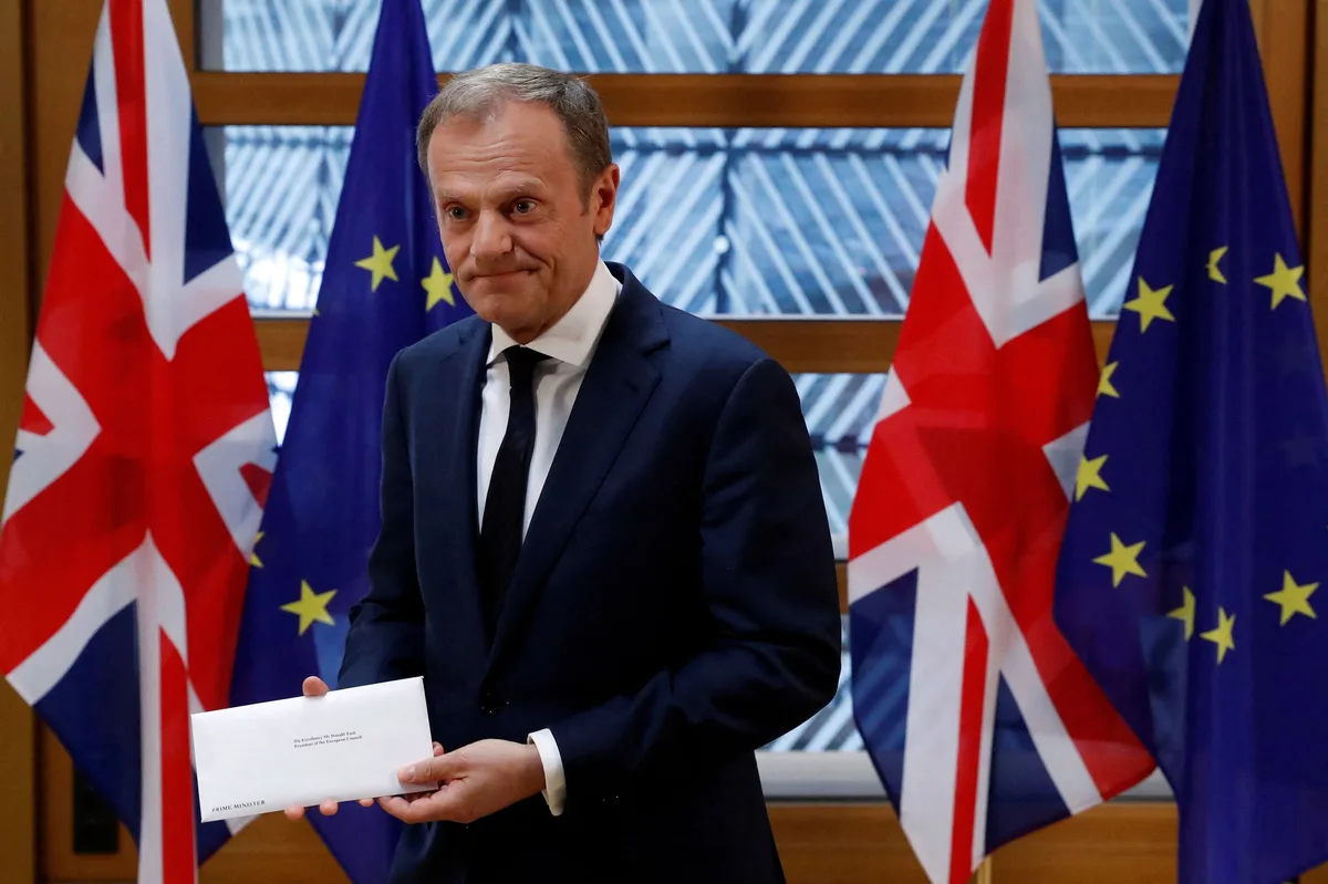
Ten years. That's how long it's been since the UK voted to leave the European Union, and the scorecard is messy. CNBC pulled together charts across the biggest economic and political pressure points — and if you thought the debate was settled, think again.
Growth, immigration, the pound, trade flows, and the political landscape have all shifted since that June 2016 referendum. Some moves were exactly what Brexiteers promised. Others were the opposite. And a few outcomes nobody saw coming at all.
Read more Heat Wave Threatens Power Grids During Peak July 4 Travel →
Sterling took an immediate hit the night the results came in and has never fully recovered its pre-vote levels. That's not just a number on a screen — a weaker pound means higher import costs, which feeds straight into inflation and squeezes real wages. Traders know this dynamic well.
Trade and immigration data are where the political noise gets loudest. Both camps claimed victory depending on which chart you held up. But the underlying trend lines don't lie — the UK's economic relationship with Europe changed structurally, and unwinding or adapting to that is a multi-decade project, not a quick policy fix.
Politically, Brexit reshuffled the entire deck. The Conservative Party dominated the immediate aftermath before suffering historic collapse. Labour returned to power. The issues that drove the Leave vote — sovereignty, immigration, economic anxiety — haven't gone away. They've just found new political vessels. For traders and investors watching UK assets, the macro backdrop remains defined by post-Brexit adjustment. Continue reading at US Top News and Analysis.